
I had a bit of fun on Twitter a few weeks back after taking delivery of a number of ex-Cambridge sweep oars. The oars themselves had an interesting story, but the conversation that came out of my daughter stating clearly that they were painted green, and not blue, provided the most entertainment.
This whole episode was taken in good humour by our friends at CUBC, even if I had to offer to pay for the next dinner with my old Australian rowing friend who works there.
At about the same time I was painting a trophy blade for ARV Westfalen Münster, a club that has both Cambridge and Oxford blue in it’s coat of arms and blade design.
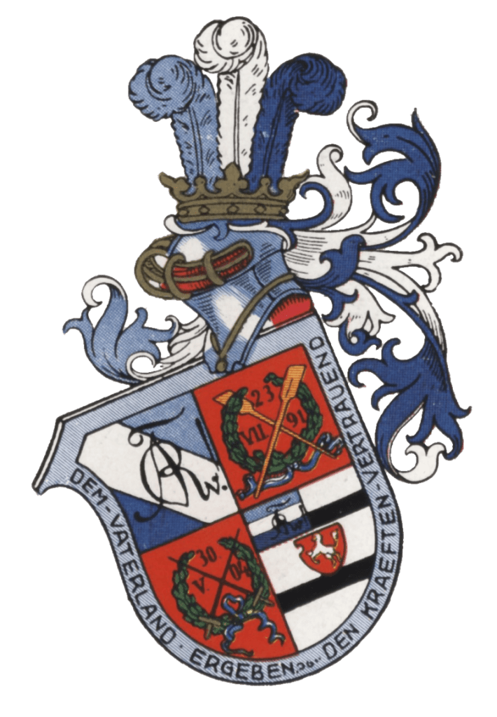
This particular rendering of the coat of arms (above) shows the lighter colour as clearly a blue. However this should be a match for Cambridge Blue. The first time I painted a trophy for the club I followed this image as a guide, but on the most recent blade I used the paint that I have for Cambridge blades.
I was lucky enough to meet a number of members of the club at the HORR this year and after delivering the blade we had a long discussion about the colours over a few pints on the balcony of Vesta RC.
It seems that Stephan Ploke from ARV Westfalen Münster had done quite a bit of research into this topic and wrote an article for their club newsletter.
We have had the article translated from the original German and it is reproduced in full below.
——————————-
Cambridge Blue origins
As every member knows, our colours were chosen at the founding of the corporation in 1904 at the suggestion of AH Sprinkmeyer as a homage to the Boat Race. Reason enough to look at the origins of these colours, in particular the slightly unconventional shading of the light blue in the form of Eton or Cambridge Blue.
At the beginning of the 19th century improved traffic and communication paths also led to a more active exchange of the Universities of Oxford and Cambridge, which soon led to the first sports competitions between the two universities; the first ever competition was a cricket match in June of 1827, in which both teams were dressed all in white.
The first rowing competition between Oxford and Cambridge took place – as well known – at Henley-on-Thames in 1829 following previous inter-university competitions, e.g. the first documented amateur races between the Oxford’s Colleges Brasenose and Jesus in 1815. In the first rowing competition Oxford vs Cambridge, the Oxford team wore blue and white striped shirts – the colours of Christ Church College, which was that years ‘Head of the River Isis’ and provided five rower for the team. Since then, the colour of Oxford is dark blue. So far, so good.
The situation in Cambridge is a bit trickier: on the day of the first race, the crew wore scarlet neck scarves as the captain of the Cambridge crew came from Lady Margaret Boat Club.
The way of the decision for “light blue” for the second comparison race between both elite universities in 1836 in London on the Tideway is quite well documented, e.g. in the books ‘Land and Water’ and ‘Boating’ by Walter Bradford Woodgates, himself a two times competitor in 1862 and 1863 as well as the author of the first book on rowing and rowing training: “Oxford wore blue shirts, and had a blue flag in their bows. Cambridge wore white. Just as Cambridge were pushing off from Searle’s [Note: a boatyard in London and Leander’s first home when the club was still based in London], someone remarked that they ought to have a ‘colour’ in the bows for the judge to identify them by. Mr. R.N. Phillips of Christ’s was standing by, and at once ran off to the nearest haberdasher. Some Etonian companion was with him, and suggested a bit of Eton ribbon (light blue) for luck. Mr Phillips accepted this hint, and bought a tiny strip of light blue ribbon, which was placed in the bow of the Cambridge boat.”
This is how light blue became the colour of Cambridge – in 1837 and 1838 there was no boat race, but Cambridge rowed against Leander and wore light blue again for both races. Later, light blue became also the colour of other sports teams and the university in general. The quoted story explains the choice of colour and establishes a relationship with Eton, but this alone does not explain or define the unusual shade of “light blue”. And this is where the story gets complicated!
So, let’s briefly focus onto Eton College and it’s blue. Regarding to the shaping process and change of Eton Blue I have asked Eleanor Hoare, archivist at Eton, for clarification and learned the following:The colour blue appeared for the first time in connection with Eton in the records statements from the semester 1625/26, where it says, “to Matthew Say, waterman, to provide him with a coat of blew azure”. As at Oxford and Cambridge, colours did not play a role at Eton until the competitions of sports started in the 19th century. Much about this is reported in “Eton Book of the River”, in which the colour in the 1829 race against Westminster is described as “pale blue”, i.e. baby blue.
Already at the fourth race in 1837, the boat of the Eton team, the ‘Britannia’, was already described as a “green eight with blue flooring”. Even the oldest surviving artefacts of Eton like some old pairs of oars and a blazer belonging to the later Prime Minister W.E. Gladstone from the year 1824, have a clear green cast. An old pattern book of the venerable university team outfitters of 1860 roughly shows the Eton Blue known today. Back to the second boat race, where Cambridge adopted the light blue: it is demonstrable that the term “Eton-Blue” just became common outside Eton around 1880. Thus the haberdasher in the above story will hardly have stocked a ribbon of that kind in 1836, but rather a classic light blue.
Furthermore, older lithographs and the original painted launching cannon used at the May Bumps in Cambridge from Victorian times speak in favour of such a colour. The Cambridge Blue got its present green tint when Alfred Twinn, who was Cambridge’s boatman for over 50 years, gradually added a more and more yellow to the colour to make it more distinguishable from the university’s hated rugby club. In this process the colour was brought closer to the actual Eton Blue. The university followed in its colour selection. However, Cambridge is home to a wide variety of shades of “light blue,” which is rather a shade of green. Anyone can get an idea of this by visiting Ryder & Amies, the venerable outfitter of Cambridge sports teams.
At Eton, too, the colour changed several times over the course of nearly two centuries and each sports team used slightly different variations until 2014, when Eton’s supplier, New & Lingwood, agreed on a uniform hue (Pantone 7464c) that is nearly identical to the official Cambridge Blue of the rowing team (NCS S 2020-g) and the university.
Worth mentioning in this context is Caius College in Cambridge (where e.g. Stephen Hawking taught), which claims to be the originator of Cambridge Blue. In fact, its colour is very similar to today’s Cambridge Blue. However, there is no evidence for this version and, in addition, as mentioned above, the colour introduced in 1836 was likely a true light blue instead of today’s Caius Blue. Rather, there is evidence that the establishment of light blue in 1836 was agreed upon because it was not the unique colour of a particular college boat club and thus rowers from all colleges could readily agree on it.
The English rowing historian Tim Koch added another interesting aspect to the discussion: In his opinion, the exact nuances of colours would not have played a special role historically. On the one hand, even today it is extremely difficult to reproduce colours uniformly and faithfully. Back in time, this would have been downright impossible. On the other hand, the idea of using colour in the sense of corporate identity did not exist in the past. These were primarily used to distinguish between two teams – no one would have attached any importance to precise shading.
To sum up, it can be said that the colours of Eton and Cambridge have differed significantly at different times and were probably never clearly defined historically. But through various coincidences and circumstances they have come very close to each other nowadays – a state of affairs that should be like this following the narrative of Philips.
Following the various interpretations of this colour in the motherland of rowing, respective variations in our club (e.g. RAL 6027 on our blades today) are certainly a sign of the vitality of history. Especially since our founding fathers before the spread of colour photography certainly also could not have had an idea corresponding to the original in mind.
Stephan Ploke
