
With this year’s Fours Head approaching, I thought I should do a post showing how I dealt with the fine detail in the new event logo that was introduced last year.
There have been many changes and new things happening with this popular event, and one of these was the adoption of a new logo and brand identity. Changing the colour of the trophy blades wasn’t going to be much of an issue, but the organisers thought it might be nice to use the new logo.
After some discussion, I said that I could do it, but only if the text was removed. This would make it a bit easier to paint, would make more room on the final design layout, and would prevent repetition with the main title painted along the top of the blade.
However, it would still be a complicated job to do well. Or would it? It was time to cheat…

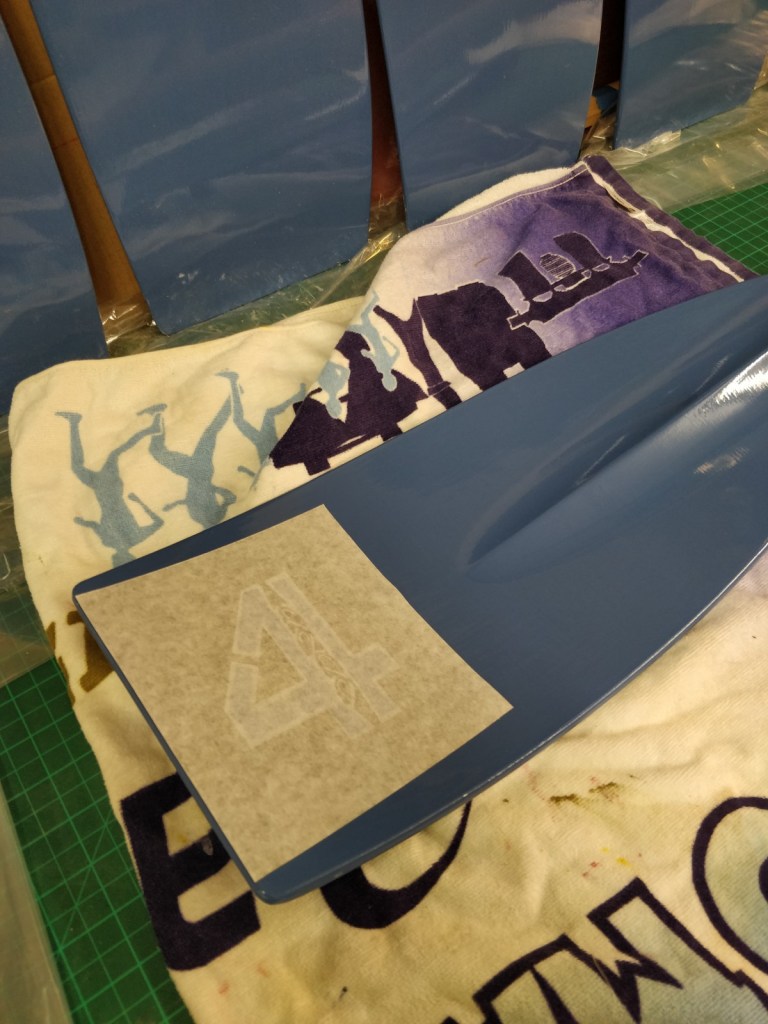
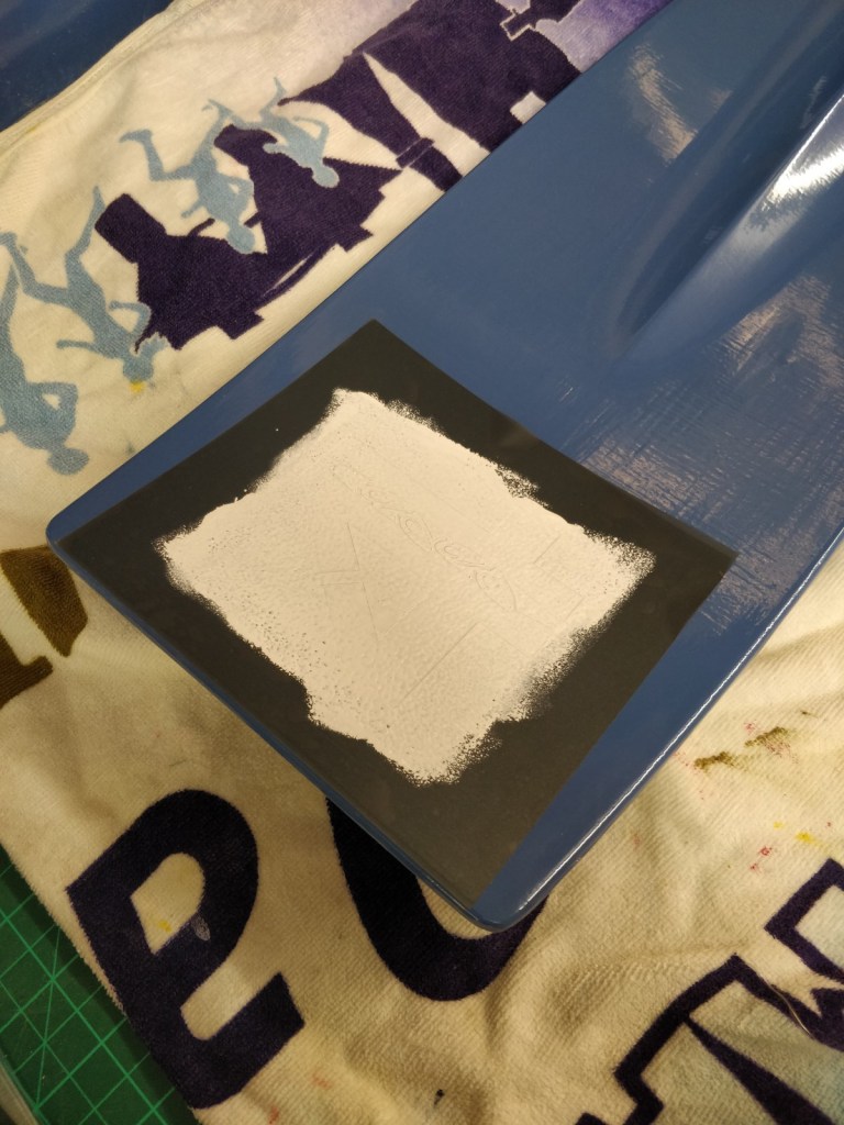
Luckily one of my very talented friends from the rowing industry has a vinyl cutter and is very handy with it. With his help we created a suitable stencil that could deal with much of the detail, but yet also be easy to apply and – most importantly – be easy to remove!
It wasn’t all simplicity and plain sailing from there, but it was a lot easier than manually masking up the 4 shape seven times!


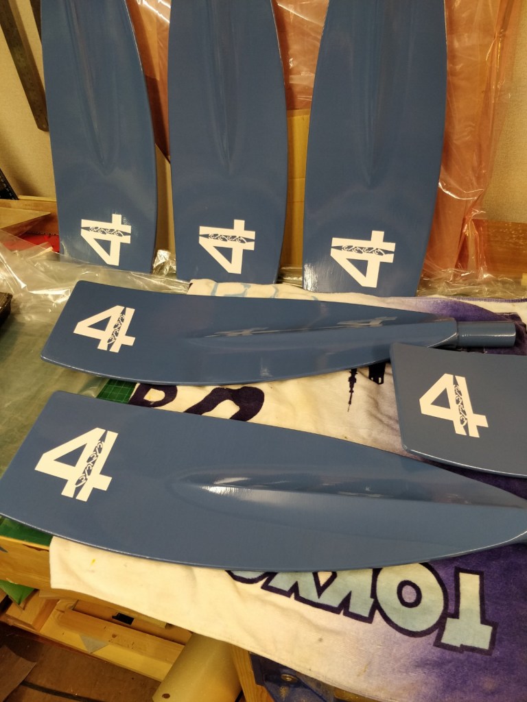

Once the basic design was applied and the details added, then it was time for the text and crew names.

