I’ve been very busy painting oars and repairing boats so I haven’t had time for a proper blog post for a while.
In lieu of something more significant, I’ve added some extra images to the gallery to show some jobs from the past 18 months or so.

31 Sunday Dec 2023
Posted in Uncategorized
I’ve been very busy painting oars and repairing boats so I haven’t had time for a proper blog post for a while.
In lieu of something more significant, I’ve added some extra images to the gallery to show some jobs from the past 18 months or so.
02 Sunday Apr 2023
Posted in Uncategorized
I had a bit of fun on Twitter a few weeks back after taking delivery of a number of ex-Cambridge sweep oars. The oars themselves had an interesting story, but the conversation that came out of my daughter stating clearly that they were painted green, and not blue, provided the most entertainment.
This whole episode was taken in good humour by our friends at CUBC, even if I had to offer to pay for the next dinner with my old Australian rowing friend who works there.
At about the same time I was painting a trophy blade for ARV Westfalen Münster, a club that has both Cambridge and Oxford blue in it’s coat of arms and blade design.

This particular rendering of the coat of arms (above) shows the lighter colour as clearly a blue. However this should be a match for Cambridge Blue. The first time I painted a trophy for the club I followed this image as a guide, but on the most recent blade I used the paint that I have for Cambridge blades.

I was lucky enough to meet a number of members of the club at the HORR this year and after delivering the blade we had a long discussion about the colours over a few pints on the balcony of Vesta RC.
It seems that Stephan Ploke from ARV Westfalen Münster had done quite a bit of research into this topic and wrote an article for their club newsletter.
We have had the article translated from the original German and it is reproduced in full below.
——————————-
Cambridge Blue origins
As every member knows, our colours were chosen at the founding of the corporation in 1904 at the suggestion of AH Sprinkmeyer as a homage to the Boat Race. Reason enough to look at the origins of these colours, in particular the slightly unconventional shading of the light blue in the form of Eton or Cambridge Blue.
At the beginning of the 19th century improved traffic and communication paths also led to a more active exchange of the Universities of Oxford and Cambridge, which soon led to the first sports competitions between the two universities; the first ever competition was a cricket match in June of 1827, in which both teams were dressed all in white.
The first rowing competition between Oxford and Cambridge took place – as well known – at Henley-on-Thames in 1829 following previous inter-university competitions, e.g. the first documented amateur races between the Oxford’s Colleges Brasenose and Jesus in 1815. In the first rowing competition Oxford vs Cambridge, the Oxford team wore blue and white striped shirts – the colours of Christ Church College, which was that years ‘Head of the River Isis’ and provided five rower for the team. Since then, the colour of Oxford is dark blue. So far, so good.
The situation in Cambridge is a bit trickier: on the day of the first race, the crew wore scarlet neck scarves as the captain of the Cambridge crew came from Lady Margaret Boat Club.
The way of the decision for “light blue” for the second comparison race between both elite universities in 1836 in London on the Tideway is quite well documented, e.g. in the books ‘Land and Water’ and ‘Boating’ by Walter Bradford Woodgates, himself a two times competitor in 1862 and 1863 as well as the author of the first book on rowing and rowing training: “Oxford wore blue shirts, and had a blue flag in their bows. Cambridge wore white. Just as Cambridge were pushing off from Searle’s [Note: a boatyard in London and Leander’s first home when the club was still based in London], someone remarked that they ought to have a ‘colour’ in the bows for the judge to identify them by. Mr. R.N. Phillips of Christ’s was standing by, and at once ran off to the nearest haberdasher. Some Etonian companion was with him, and suggested a bit of Eton ribbon (light blue) for luck. Mr Phillips accepted this hint, and bought a tiny strip of light blue ribbon, which was placed in the bow of the Cambridge boat.”
This is how light blue became the colour of Cambridge – in 1837 and 1838 there was no boat race, but Cambridge rowed against Leander and wore light blue again for both races. Later, light blue became also the colour of other sports teams and the university in general. The quoted story explains the choice of colour and establishes a relationship with Eton, but this alone does not explain or define the unusual shade of “light blue”. And this is where the story gets complicated!
So, let’s briefly focus onto Eton College and it’s blue. Regarding to the shaping process and change of Eton Blue I have asked Eleanor Hoare, archivist at Eton, for clarification and learned the following:The colour blue appeared for the first time in connection with Eton in the records statements from the semester 1625/26, where it says, “to Matthew Say, waterman, to provide him with a coat of blew azure”. As at Oxford and Cambridge, colours did not play a role at Eton until the competitions of sports started in the 19th century. Much about this is reported in “Eton Book of the River”, in which the colour in the 1829 race against Westminster is described as “pale blue”, i.e. baby blue.
Already at the fourth race in 1837, the boat of the Eton team, the ‘Britannia’, was already described as a “green eight with blue flooring”. Even the oldest surviving artefacts of Eton like some old pairs of oars and a blazer belonging to the later Prime Minister W.E. Gladstone from the year 1824, have a clear green cast. An old pattern book of the venerable university team outfitters of 1860 roughly shows the Eton Blue known today. Back to the second boat race, where Cambridge adopted the light blue: it is demonstrable that the term “Eton-Blue” just became common outside Eton around 1880. Thus the haberdasher in the above story will hardly have stocked a ribbon of that kind in 1836, but rather a classic light blue.
Furthermore, older lithographs and the original painted launching cannon used at the May Bumps in Cambridge from Victorian times speak in favour of such a colour. The Cambridge Blue got its present green tint when Alfred Twinn, who was Cambridge’s boatman for over 50 years, gradually added a more and more yellow to the colour to make it more distinguishable from the university’s hated rugby club. In this process the colour was brought closer to the actual Eton Blue. The university followed in its colour selection. However, Cambridge is home to a wide variety of shades of “light blue,” which is rather a shade of green. Anyone can get an idea of this by visiting Ryder & Amies, the venerable outfitter of Cambridge sports teams.
At Eton, too, the colour changed several times over the course of nearly two centuries and each sports team used slightly different variations until 2014, when Eton’s supplier, New & Lingwood, agreed on a uniform hue (Pantone 7464c) that is nearly identical to the official Cambridge Blue of the rowing team (NCS S 2020-g) and the university.
Worth mentioning in this context is Caius College in Cambridge (where e.g. Stephen Hawking taught), which claims to be the originator of Cambridge Blue. In fact, its colour is very similar to today’s Cambridge Blue. However, there is no evidence for this version and, in addition, as mentioned above, the colour introduced in 1836 was likely a true light blue instead of today’s Caius Blue. Rather, there is evidence that the establishment of light blue in 1836 was agreed upon because it was not the unique colour of a particular college boat club and thus rowers from all colleges could readily agree on it.
The English rowing historian Tim Koch added another interesting aspect to the discussion: In his opinion, the exact nuances of colours would not have played a special role historically. On the one hand, even today it is extremely difficult to reproduce colours uniformly and faithfully. Back in time, this would have been downright impossible. On the other hand, the idea of using colour in the sense of corporate identity did not exist in the past. These were primarily used to distinguish between two teams – no one would have attached any importance to precise shading.
To sum up, it can be said that the colours of Eton and Cambridge have differed significantly at different times and were probably never clearly defined historically. But through various coincidences and circumstances they have come very close to each other nowadays – a state of affairs that should be like this following the narrative of Philips.
Following the various interpretations of this colour in the motherland of rowing, respective variations in our club (e.g. RAL 6027 on our blades today) are certainly a sign of the vitality of history. Especially since our founding fathers before the spread of colour photography certainly also could not have had an idea corresponding to the original in mind.
Stephan Ploke
07 Monday Nov 2022
Posted in Uncategorized
A few months ago I was contacted by one of my rowing industry friends with a need to find some timber oars for a project.
Aside from being a handy oarsman, lovely fella, and a very talented cabinet maker, Rob has created some very unique rowing related pieces of furniture and art. His website has some lovely images in the galleries.
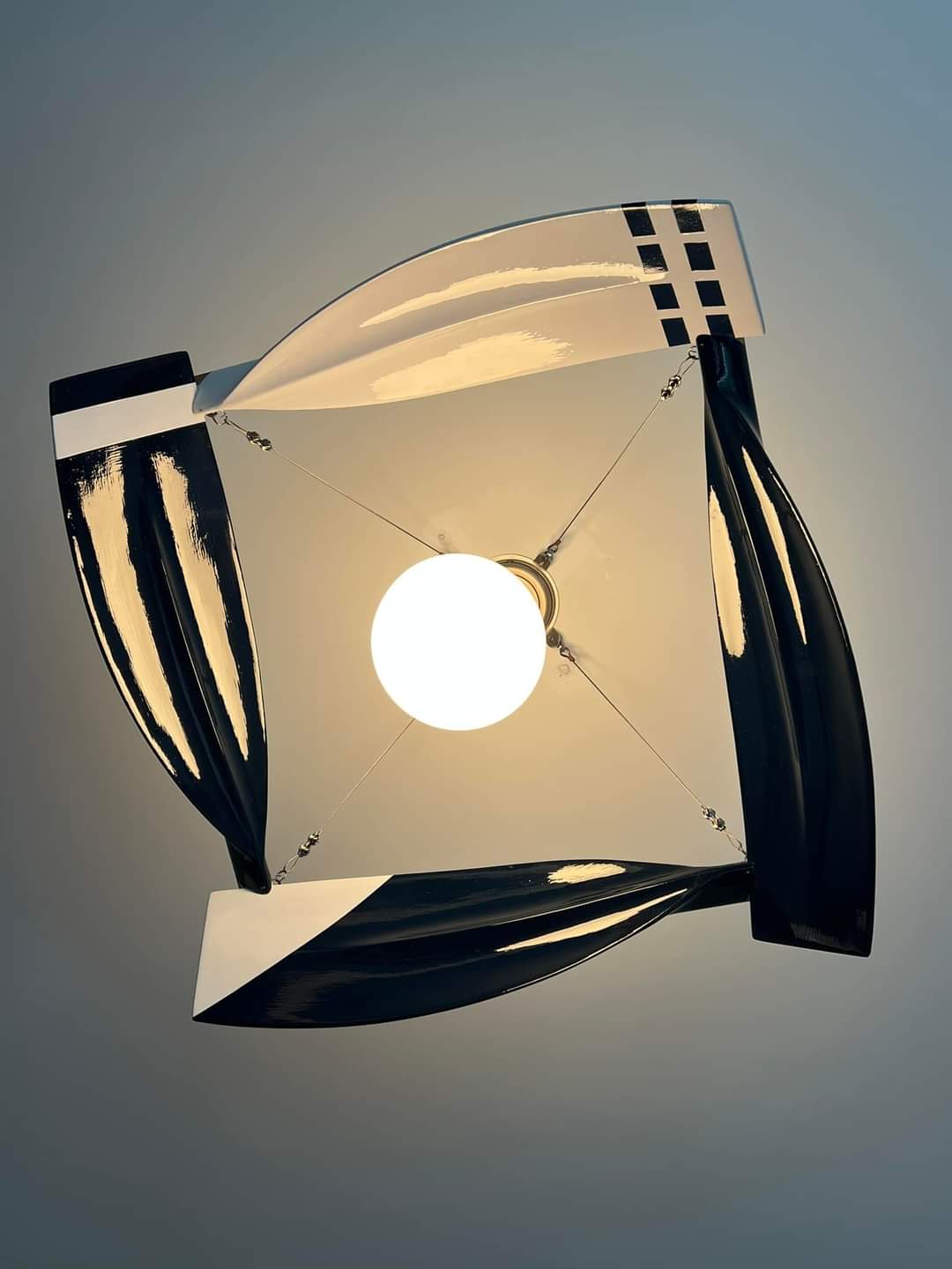
Rob was creating a special ceiling light fitting for a client that used a number of oar blades. At first I was imagining something a bit like a ceiling fan, but he had come up with something much more clever than that. It wasn’t until he returned the blades to me for painting that I could see how clever he had been.
Once I had painted up the blades in the assorted club colours that the client and their family had rowed for, Rob did the final assembly and installation.
I think you’ll agree that this works very well!

05 Saturday Nov 2022
Posted in Uncategorized
With this year’s Fours Head approaching, I thought I should do a post showing how I dealt with the fine detail in the new event logo that was introduced last year.
There have been many changes and new things happening with this popular event, and one of these was the adoption of a new logo and brand identity. Changing the colour of the trophy blades wasn’t going to be much of an issue, but the organisers thought it might be nice to use the new logo.
After some discussion, I said that I could do it, but only if the text was removed. This would make it a bit easier to paint, would make more room on the final design layout, and would prevent repetition with the main title painted along the top of the blade.
However, it would still be a complicated job to do well. Or would it? It was time to cheat…
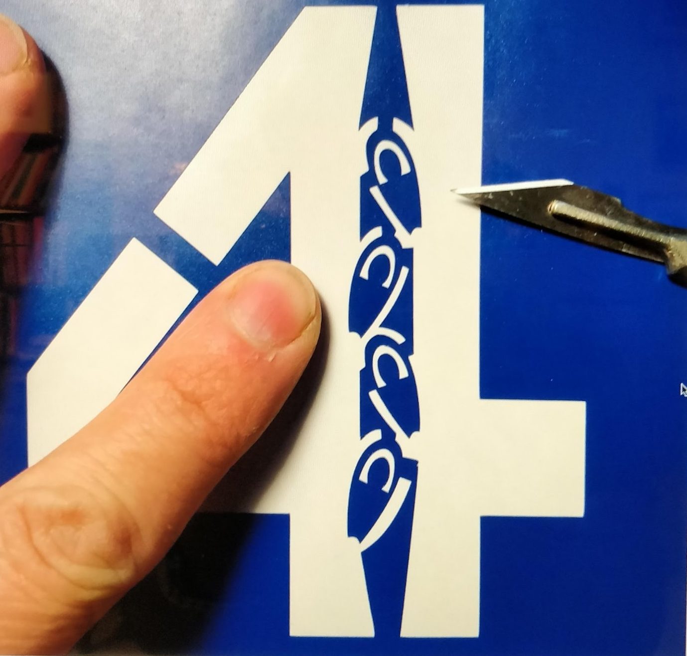
Luckily one of my very talented friends from the rowing industry has a vinyl cutter and is very handy with it. With his help we created a suitable stencil that could deal with much of the detail, but yet also be easy to apply and – most importantly – be easy to remove!
It wasn’t all simplicity and plain sailing from there, but it was a lot easier than manually masking up the 4 shape seven times!

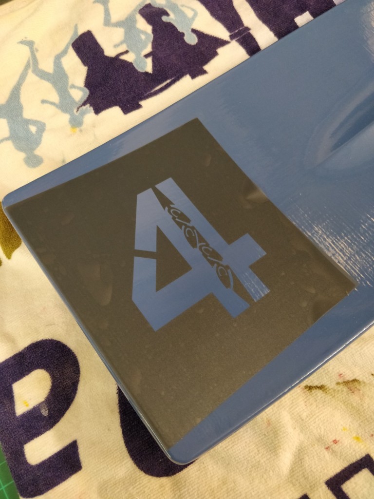


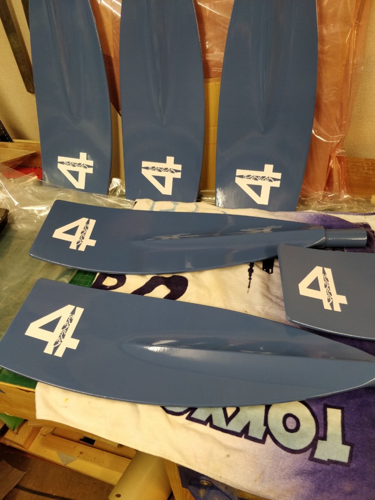

Once the basic design was applied and the details added, then it was time for the text and crew names.

03 Thursday Nov 2022
Posted in Uncategorized
I’ve only just realised (or rather ‘remembered’) that I haven’t done a post for almost a year!
Rest assured that I have been busy and that I’ll gather some images of some more recent jobs soon.
22 Sunday Aug 2021
Posted in Uncategorized
I’ve been busy with a lot of different things in recent months. Here’s a few pictures to show you some of the work.
I was loaned the original Row Zambezi blade (done by another artist) in order to create two new blades. The first difficult task was to match the paint colours, but as you can see my regular paint shop came up trumps!


The final paint job on the blades came up very well (as did the matching mounts for all three) and there is a very long and amusing story about the presentation!


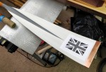
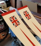
Another job was a pair of oars for someone. The Union Jack is always a challenge, but so too is duplicating an existing oar. The client had borrowed his friend’s university blade and I provided a near millimetre perfect copy.


And to prove that I’ve got rocks in my head, here are the painted rocks I did for my own garden – at the request of my wife and another one of the keen resident gardeners. (The garden is shared – it’s a 75 apartment building).


19 Friday Feb 2021
Posted in Uncategorized
Although I’m playing catch up on the blogging side of things, there have been a few jobs completed and delivered in recent months.
A couple of these have employed a simple new – and rather discreet – mounting method.


Both oars are mounted high on plain surfaces. Many of my other mounting methods using timber plates with brass hooks and so on would have looked quite distracting on these modern clear spaces. The mounts used here are almost invisible unless you get right up close below the oar and look up. You can just see the shadow of one mount in the left hand image.
Although there are slight differences between these two examples (round shaft on the carbon oar vs flat on the back of the timber), the overall result is the same. Small timber blocks act as a stand-off from the wall for a nice visual line and to prevent the collar hitting the wall. The block then has a slotted mirror plate fitted. With two mounts fitted a set distance apart, it is quite easy to put two appropriately secured screws into the wall for fitting.


Both clients very pleased with their oars and with how they are neatly displayed.
18 Thursday Feb 2021
Posted in Uncategorized
Instead of my usual wordy posts, have a picture rich one showing some of the more fun recent works.


17 Wednesday Feb 2021
Posted in Uncategorized
A few weeks before Christmas last year I received a message from an old rowing friend who lives overseas. His wedding anniversary was coming up and he wanted to paint a trophy blade for his wife as a gift. No problem I thought. I can do that.
Then he told me the date he needed it. THAT would be an issue.
Then he solved one problem for me by telling me that he wanted to paint it himself. And then he asked me if I could tell him how.
Sure. How hard could it be? I used to be a Design Tech teacher. Surely I could show a grown up how to do something using a few messages and images.
(* apologies that I have no images to show – we have to protect the names of the innocent…)
It started off quite easily. I’ve helped a few clubs before with blade repair and preparation for paint, so I already had emails with step by step instructions that I could forward on. Sanding, filling, sanding, more filling, priming, sanding, undercoating, sanding. Simples.
The top coat wasn’t so simple as there is a bit of skill and experienced involved in getting good coverage, a smooth finish, and also avoiding any drips or runs. On top of that the design had two colours that needed to be masked off and done separately. Let’s just say, that for a bloke who’s in a very technical and specialised field of high finance who has probably not painted anything since primary school, it was not too bad.
With a few sample images from my archive to act as a guide, he made a stencil and marked up the design very well. Then things got a bit difficult. Most people are fine with a pen in their hands, but few are comfortable writing with a brush.
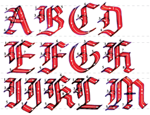
To get him comfortable with a brush I asked him to look up some step by step calligraphy images and to see how to build up the letters with pen/brushstrokes. Instead of dabbing at it randomly to try to build up an image that looked like writing, he should approach it as if he was writing. A quick demonstration video also helped.
The club logo is quite detailed and he did get a bit frustrated with that, but then he had a great idea. Would a paint marker pen be OK for the fine detail? Yes it would!
The finished job was a bit wobbly in spots, but it was his first ever go at this – and all from very much a standing start with no applicable artistic experience to fall back on. He was a bit down about it at times during the process, but I did have to remind him that I’ve got more than 20 years of experience at this, so of course my demonstration videos made it look easy!
However, the most important thing was the recipient. His wife would have been pleased to get a blade that I painted, but to get one that her husband had painted was all the more special on their anniversary.
25 Tuesday Aug 2020
Posted in Uncategorized
I have recently completed an oar renovation and painting job that celebrated the famous 1948 Olympic win of Bert Bushnell and Dickie Burnell. It’s a great story that I wish I had time to re-tell, but if you are keen you can watch the film version or read a few articles at the Hear the Boat Sing blog.
The blades themselves were in very good condition for their age. They are made from a single piece of wood and are likely pre-WW1. The leather sleeve and collar were in excellent condition, but the protective copper blade tips were rather sad. The design for painting was to mimic those used by Bert and Dickie.

Sam Hoare as Dickie Burnell and Matt Smith as Bert Bushnell in the BBC film Bert and Dickie
After stripping back the old varnish and years of grime, the old tips were removed, the blades repaired and the shafts revarnished. I prepared the blades in a two tone undercoat to make the later top coats a little easier to do.


With new material sourced (you can imagine how difficult 0.4mm copper sheet is to find) and a few handy tips from Master Craftsman Mark Edwards of Richmond Bridge, I set about making replacement copper tips.


Next up was the detailed paint work required for a Union Jack. All those straight lines might sound easy, but quite a lot of tape was used to get the job done.


Then after all that there was some text to do!

All in all quite a fun job to do.
